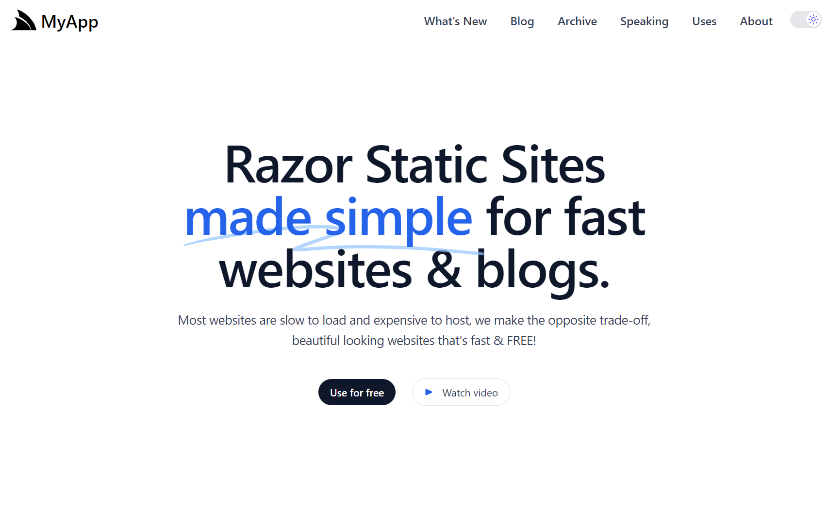
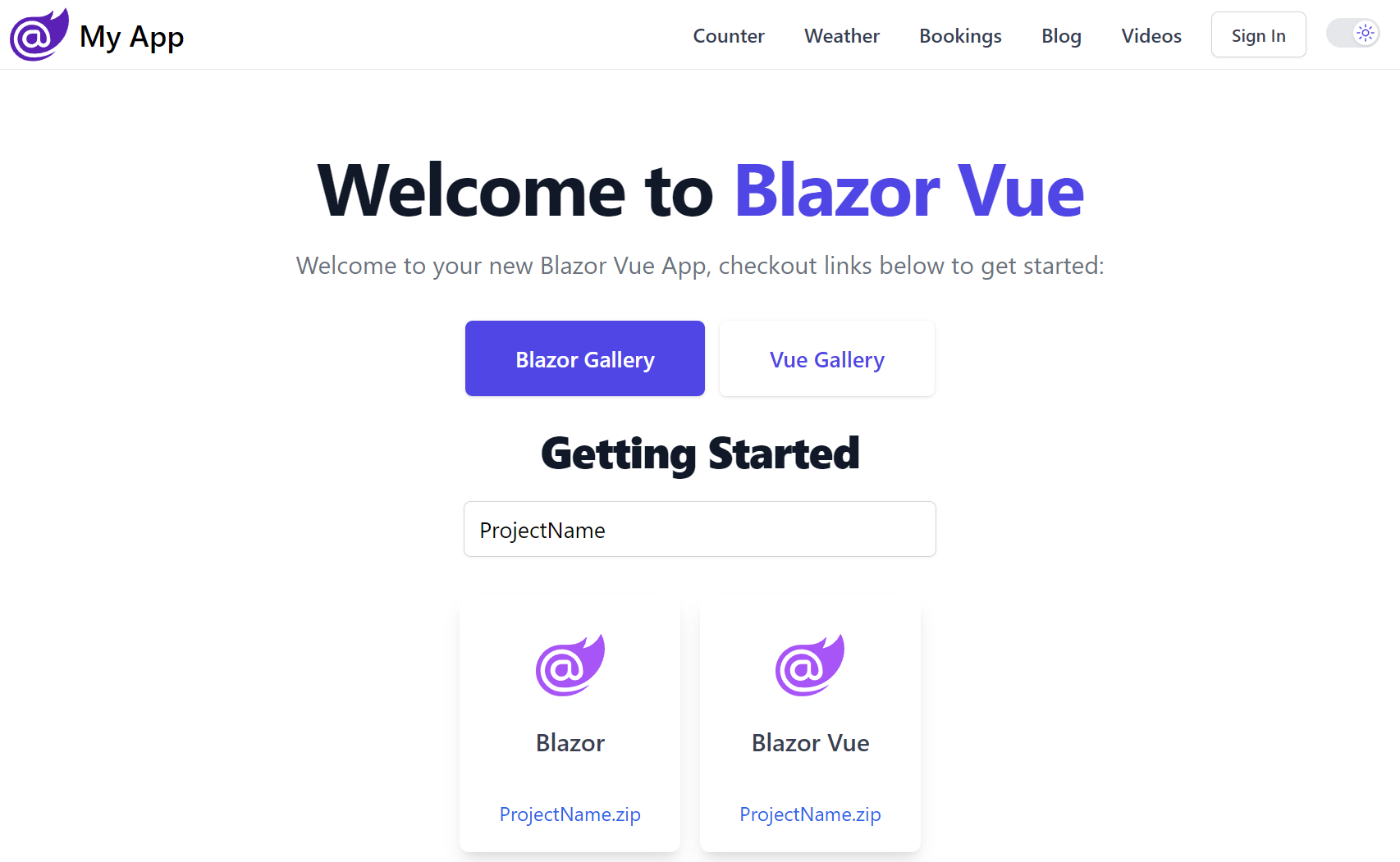
Vite Press Plugin

The Vite Press Plugin is an alternative to VitePress for adding Markdown features to existing Vite Vue or React projects. It's a non-intrusive plugin for Vue and React Vite apps that want to add markdown powered content features without needing to adopt an opinionated framework for their entire App.
Universal Markdown Features
A goal for vite-press-plugin is to implement a suite of universal markdown-powered features that can be reused across Vue, React and .NET Razor and Blazor projects, allowing you to incorporate same set of markdown feature folders to power markdown content features across a range of websites built with different technologies.
Vite Apps with vite-press-plugin
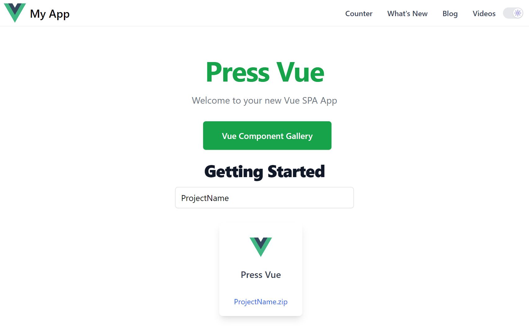
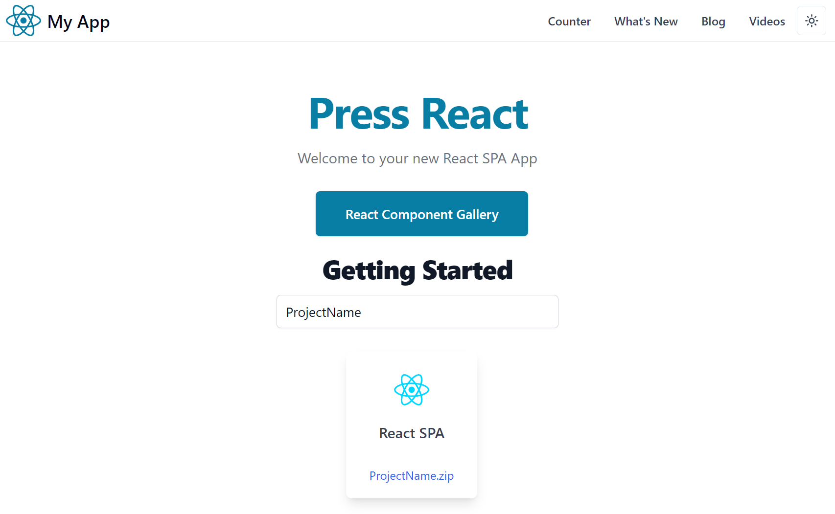
The vite-press-plugin currently powers the markdown features in the static Vite Vue and React templates which are ideal for creating static websites, blogs, documentation and marketing websites that can be hosted FREE on GitHub Pages CDN:
Static Vite Templates with vite-press-plugin
- press-vue - Vite Vue App
- press-react - Vite React App
The vite-press-plugin makes the Markdown features available to the Vite App, whilst the markdown rendering itself is optimally implemented in:
- Vue Templates - with markdown-it in Vue SFC Components
- React Templates - with remark and MDX in React Components
.NET 8 API backend with Vite Vue & React SPA frontend
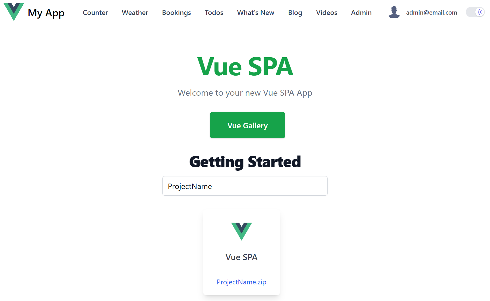
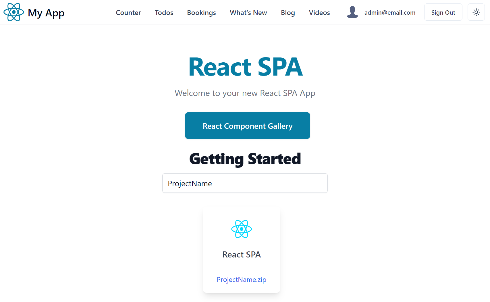
When more capabilities are required and you want a .NET API backend to your Vite Vue or React SPA frontend, you can use one of our integrated .NET 8 SPA templates:
.NET Templates with C# and Markdig
Whilst the same Markdown feature folders are implemented in C# and rendered with Markdig and either Razor Pages or Blazor Components:
.NET 8 Razor SSG and Blazor SSR Templates
- razor-ssg - .NET Razor SSG Blog and Marketing Website with Markdig
- razor-press - .NET Razor SSG Documentation Website with Markdig
- blazor-vue - .NET 8 Blazor Server Rendered Website with Markdig
Markdown Feature Folders
The content for each Markdown feature is maintained within its own feature folder with a _ prefix:
Markdown Document Structure
Additional metadata for each markdown page is maintained in the frontmatter of each markdown page, e.g. the front matter for this blog post contains:
---
title:   Vite Press Plugin
summary: Introducing the Vite Press Plugin
author:  Lucy Bates
tags:    [docs,markdown]
image:   https://picsum.photos/2000/1000
---
The frontmatter is used in combination with file attributes to populate the document metadata. The schema used to support the current markdown features include:
type Doc = {
    title: string     // title of Markdown page (frontmatter)
    slug: string      // slug to page (populated)
    path: string      // path to page (populated)
    fileName: string  // filename of markdown file (populated)
    content: string   // markdown content (populated)
    date: string      // date of page (frontmatter)
    tags: string[]    // related tags (frontmatter)
    order?: number    // explicit page ordering (frontmatter)
    group?: string    // which group page belongs to (populated)
    draft?: boolean   // make visible in production (frontmatter)
    wordCount: number      // (populated)
    lineCount: number      // (populated)
    minutesToRead: number  // (populated)
}

type Post = Doc & {
    summary: string // short summary of blog post (frontmatter)
    author: string  // author of blog post (frontmatter)
    image: string   // hero image of blog post (frontmatter)
}

type Video = Doc & {
    url: string // URL of YouTube Video
}

type WhatsNew = Doc & {
    url: string    // URL of YouTube Video
    image: string  // Image to display for feature
}
Markdown files can contain additional frontmatter which is also merged with the document metadata.
Accessing Markdown Metadata
In Vue App's the Metadata is available as an injected dependency that's navigable with the typed VirtualPress schema, e.g:
import type { VirtualPress } from "vite-plugin-press"

const press:VirtualPress = inject('press')!
In React App's it's available via an injected context:
import { PressContext } from "@/contexts"

const press = useContext(PressContext)
Which is defined as:
import { createContext } from 'react'
import type { VirtualPress } from 'vite-plugin-press'

export const PressContext = createContext<VirtualPress>({} as VirtualPress)
This VirtualPress metadata is used to power all markdown features.
Blog
The blog maintains its markdown posts in a flat /_posts folder which each Markdown post containing its publish date and URL slug it should be published under, e.g:
Supporting all Blog features requires several different pages to render each of its view:
| Description | Example | Vue | React |
|---|---|---|---|
| Main Blog layout | /blog | blog.vue | blog.tsx |
| Navigable Archive of Posts | /posts | index.vue | index.tsx |
| Individual Blog Post (like this!) | /posts/vite-press-plugin | [slug].vue | [slug].tsx |
| Display Posts by Author | /posts/author/lucy-bates | [name].vue | [name].tsx |
| Display Posts by Tag | /posts/tagged/markdown | [tag].vue | [tag].tsx |
| Display Posts by Year | /posts/year/2024 | [year].vue | [year].tsx |
Configuration
Additional information about the Website Blog is maintained in _posts/config.json
{
  "localBaseUrl": "http://localhost:5173",
  "publicBaseUrl": "https://press-vue.servicestack.net",
  "siteTwitter": "@Vue",
  "blogTitle": "From the blog",
  "blogDescription": "Writing on software design and aerospace industry.",
  "blogEmail": "email@example.org (Vue)",
  "blogImageUrl": "https://servicestack.net/img/logo.png"
}
Authors
Whilst information about Post Authors are maintained in _posts/authors.json
[
  {
    "name": "Lucy Bates",
    "email": "lucy@email.org",
    "bio": "Writing on software design and aerospace industry.",
    "profileUrl": "/img/profiles/user1.svg",
    "twitterUrl": "https://twitter.com/lucy",
    "threadsUrl": "https://threads.net/@lucy",
    "gitHubUrl": "https://github.com/lucy"
  },
]
To associate an Author the name property is used to match a posts frontmatter author.
General Features
Most unique markdown features are captured in their Markdown's frontmatter metadata, but in general these features are broadly available for all features:
- Live Reload - Latest Markdown content is displayed during Development
- Drafts - Prevent posts being worked on from being published with
draft: true - Future Dates - Posts with a future date wont be published until that date
What's New Feature
The /whatsnew page is an example of creating a custom Markdown feature to implement a portfolio or a product releases page where a new folder is created per release, containing both release date and release or project name, with all features in that release maintained markdown content sorted in alphabetical order:
What's New follows the same structure as Pages feature which is rendered in:
Videos Feature
The videos feature maintained in the _videos folder allows grouping of related videos into different folder groups, e.g:
These can then be rendered as UI fragments using the <VideoGroup> component, e.g:
<VideoGroup
  title="Vue Components"
  summary="Learn about productive features in Vue Component Library"
  group="vue"
  learnMore="https://docs.servicestack.net/vue/" />
Includes Feature
The includes feature allows maintaining reusable markdown fragments in the _includes folder, e.g:
Which can be included in other Markdown files with:
:::include privacy.md:::

:::include features/include.md:::
Alternatively they can be included in other Vue, React or Markdown pages with the <Include> component, e.g:
<Include src="privacy.md" />

<Include src="features/include.md" />
Metadata APIs Feature
To support external clients from querying static markdown metadata you can export it to pre-rendered static *.json
data structures by configuring metadataPath to the location you the *.json files published to, e.g:
export default defineConfig({
    plugins: [
        Press({
            metadataPath: 'public/api',
        }),
    ]
})
This will publish all the content of each content type in the year they were published in, along with an all.json containing
all content published in that year as well aso for all time, e.g:
With this you can fetch the metadata of all the new Blog Posts added in 2023 from:
Or all the website content added in 2024 from:
Or ALL the website metadata content from:
This feature makes it possible to support use-cases like CreatorKit's Generating Newsletters feature which generates a Monthly Newsletter Email with all new content added within a specified period.
Markdown Containers
Most of VitePress Containers are also implemented, enabling rich markup to enhance markdown content and documentation universally across all Markdown App implementations:
Input
:::info
This is an info box.
:::

:::tip
This is a tip.
:::

:::warning
This is a warning.
:::

:::danger
This is a dangerous warning.
:::
Output
INFO
This is an info box.
TIP
This is a tip.
WARNING
This is a warning.
DANGER
This is a dangerous warning.
Custom Title
You can specify a custom title by appending the text right after the container type:
Input
:::danger STOP
Danger zone, do not proceed
:::
Output
STOP
Danger zone, do not proceed
copy
The copy container is ideal for displaying text snippets in a component that allows for easy copying:
Input
:::copy
Copy Me!
:::
Output
Copy Me!
HTML or XML fragments can also be copied by escaping them first:
Input
:::copy
`<PackageReference Include="ServiceStack" Version="8.*" />`
:::
Output
<PackageReference Include="ServiceStack" Version="8.*" />
sh
Similarly the sh container is ideal for displaying and copying shell commands:
Input
:::sh
npm run dev
:::
Output
npm run dev
YouTube
For embedding YouTube Videos, optimally rendered using the <LiteYouTube> component, e.g:
Input
:::youtube YIa0w6whe2U
Vue Components Library
:::
Output
Markdown Fenced Code Blocks
For more flexibility you can utilize custom fenced components like the files fenced code block which can
be used to capture ascii representation of a structured documentation like a folder & file structure, e.g:
```files
/_videos
  /vue
    admin.md
    autoquerygrid.md
    components.md
  /react
    locode.md
    bookings.md
    nextjs.md
```
That we can render into a more UX-friendly representation by calling the Files component with the body
of the code-block to convert the structured ascii layout into a more familiar GUI layout:
The benefit of this approach of marking up documentation is that the markdown content still remains in an optimal human-readable form even when the markdown renderer lacks the custom fenced components to render the richer UI.
Components In Markdown
Up till now all above features will let you render the same markdown content in all available Vue, React, Razor or Blazor templates. At the cost of reduced portability, you're also able to embed rich Interactive Vue or React components directly in markdown.

