Creating a custom Explorer UI for OpenAIs Chat API


Anyone who's used ServiceStack's built-in API Explorer or Auto HTML API UIs know that not all API Explorer UIs are created equal.
The differences are more pronounced as APIs get larger and more complex which we can see by comparing it with
Swagger UI for rendering AI Chat's ChatCompletion API:
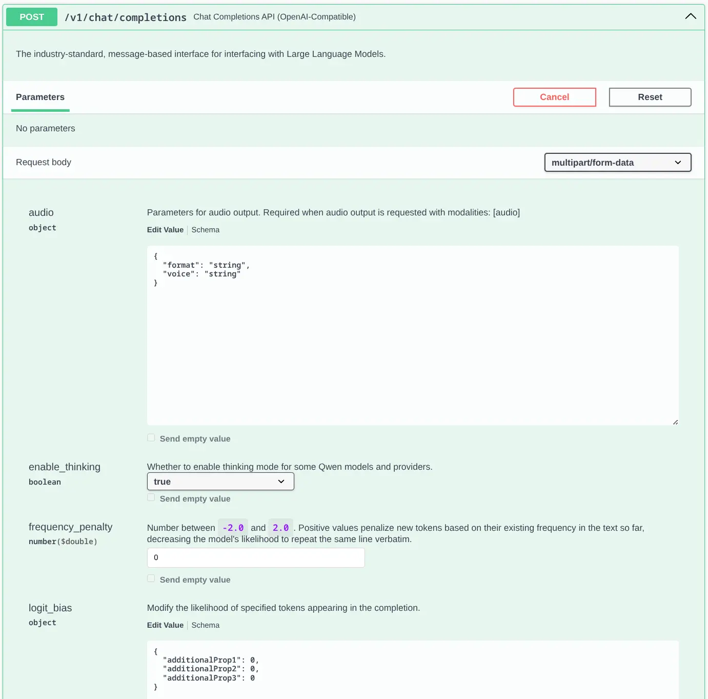
This is just the tip of the iceberg, the full-length Swagger UI Screenshot is absurdly long, past the point of being usable.
As expected from a generic UI we get very little assistance from the UI on what values are allowed, the numeric fields
aren't number inputs and the only dropdowns we see are for bool properties to select from their true and false values.
There's not going to be any chance for it to be able to show App-specific options like which models are currently enabled.
API Explorer UI
By contrast here is the same API rendered with ServiceStack's API Explorer:
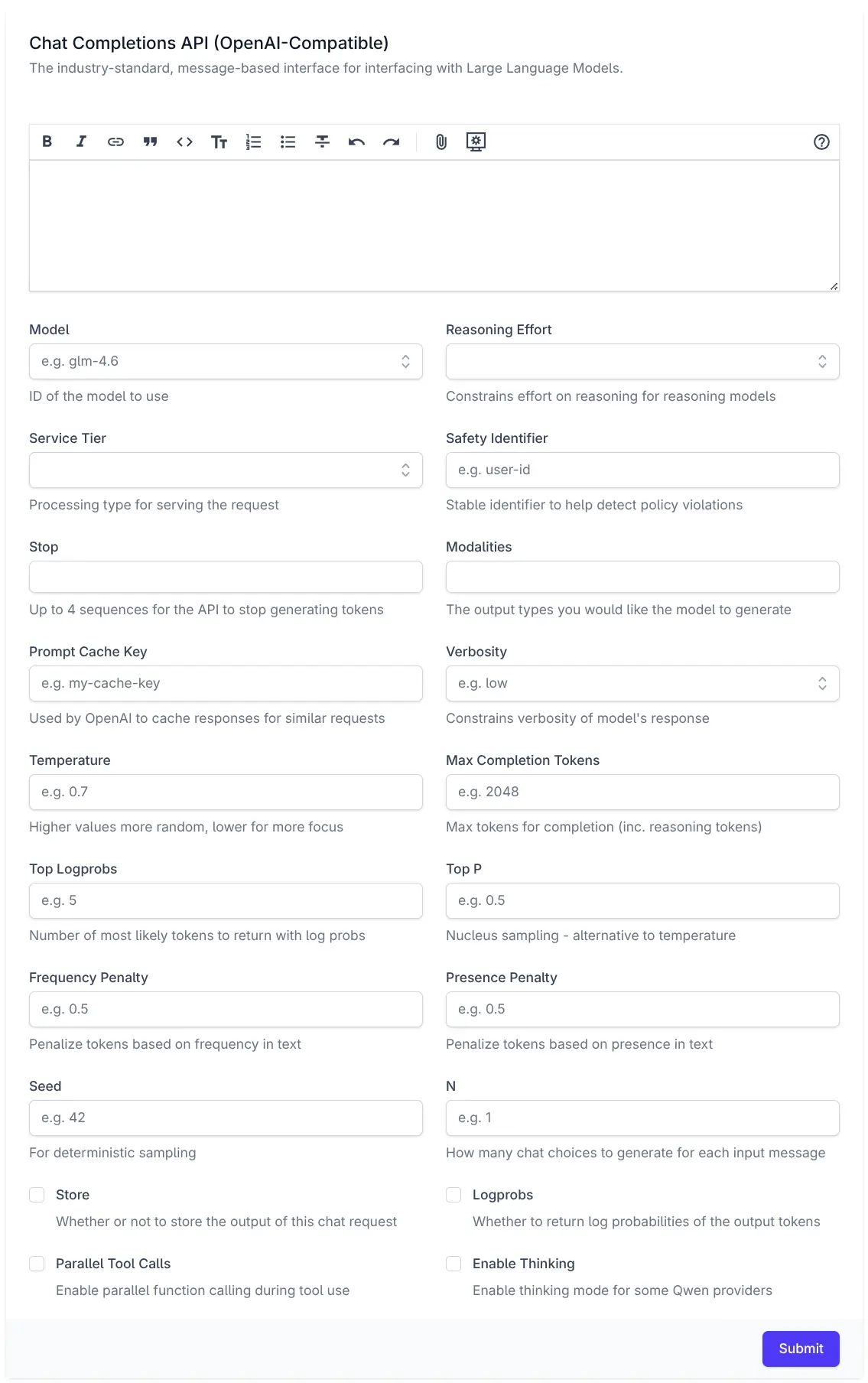
This is much closer to what you'd expect from a hand-crafted Application UI and far more usable.
Properties use optimized UI Components
It renders an optimized UI for each property, with the Model, Reasoning Effort, Service Tier and Verbosity properties all using a Combobox component for quickly searching through a list of supported options, or they can choose to enter a custom value.
Bool properties use Checkboxes whilst Numeric fields use number inputs, with integer properties only allowing integer values and floating point properties being able to step through fractional values.
UI-specific text hints
Each property also contains placeholder text and help text hints that's more focused and concise than the verbose API documentation.
HTML client-side validation
Client-side HTML validation ensure properties are valid and within any configured min/max values before any request is sent.
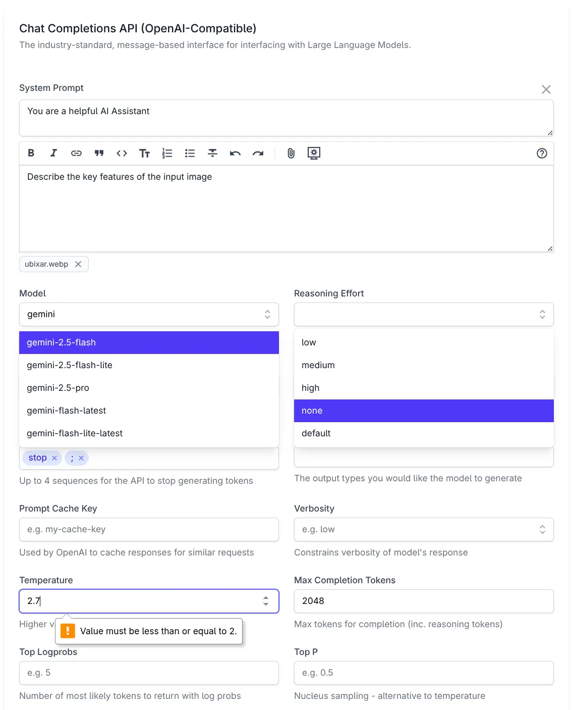
Custom Components for Complex Properties
The only property that doesn't use a built-in component is Messages which is rendered with a custom
ChatMessages component purpose-built to populate the List<AiMessage> Messages property. It uses a Markdown Editor
for the UserPrompt, a collapsible Textarea for any System Prompt and the ability to attach image, audio & file
document attachments to the API request.
How is it done?
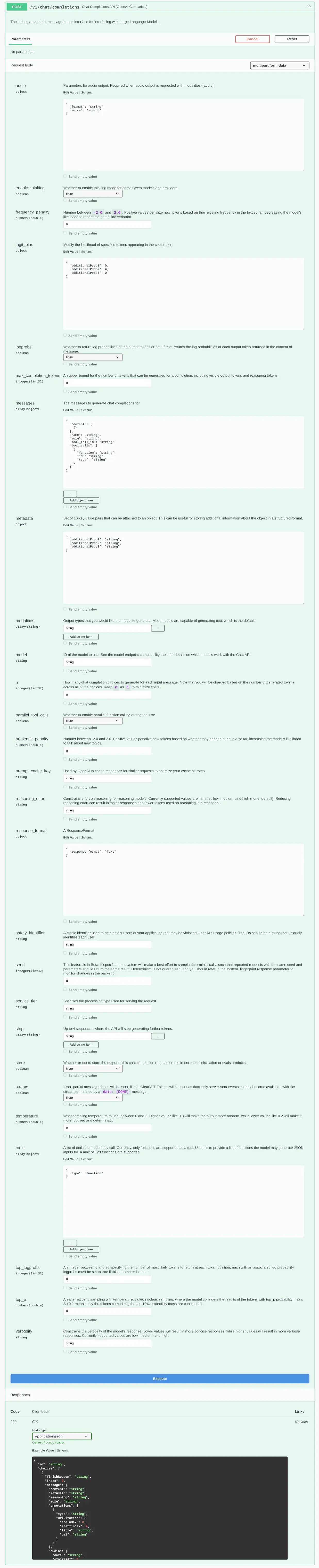
The entire UI is driven by these declarative annotations added on the ChatCompletion Request DTO:
[Description("Chat Completions API (OpenAI-Compatible)")]
[Notes("The industry-standard, message-based interface for interfacing with Large Language Models.")]
public class ChatCompletion : IPost, IReturn<ChatResponse>
{
    [DataMember(Name = "messages")]
    [Input(Type = "ChatMessages", Label=""), FieldCss(Field = "col-span-12")]
    public List<AiMessage> Messages { get; set; } = [];

    [DataMember(Name = "model")]
    [Input(Type = "combobox", EvalAllowableValues = "Chat.Models", Placeholder = "e.g. glm-4.6", Help = "ID of the model to use")]
    public string Model { get; set; }

    [DataMember(Name = "reasoning_effort")]
    [Input(Type="combobox", EvalAllowableValues = "['low','medium','high','none','default']", Help = "Constrains effort on reasoning for reasoning models")]
    public string? ReasoningEffort { get; set; }

    [DataMember(Name = "service_tier")]
    [Input(Type = "combobox", EvalAllowableValues = "['auto','default']", Help = "Processing type for serving the request")]
    public string? ServiceTier { get; set; }

    [DataMember(Name = "safety_identifier")]
    [Input(Type = "text", Placeholder = "e.g. user-id", Help = "Stable identifier to help detect policy violations")]
    public string? SafetyIdentifier { get; set; }

    [DataMember(Name = "stop")]
    [Input(Type = "tag", Max = "4", Help = "Up to 4 sequences for the API to stop generating tokens")]
    public List<string>? Stop { get; set; }

    [DataMember(Name = "modalities")]
    [Input(Type = "tag", Max = "3", Help = "The output types you would like the model to generate")]
    public List<string>? Modalities { get; set; }

    [DataMember(Name = "prompt_cache_key")]
    [Input(Type = "text", Placeholder = "e.g. my-cache-key", Help = "Used by OpenAI to cache responses for similar requests")]
    public string? PromptCacheKey { get; set; }

    [DataMember(Name = "tools")]
    public List<Tool>? Tools { get; set; }

    [DataMember(Name = "verbosity")]
    [Input(Type = "combobox", EvalAllowableValues = "['low','medium','high']", Placeholder = "e.g. low", Help = "Constrains verbosity of model's response")]
    public string? Verbosity { get; set; }

    [DataMember(Name = "temperature")]
    [Input(Type = "number", Step = "0.1", Min = "0", Max = "2", Placeholder = "e.g. 0.7", Help = "Higher values more random, lower for more focus")]
    public double? Temperature { get; set; }

    [DataMember(Name = "max_completion_tokens")]
    [Input(Type = "number", Value = "2048", Step = "1", Min = "1", Placeholder = "e.g. 2048", Help = "Max tokens for completion (inc. reasoning tokens)")]
    public int? MaxCompletionTokens { get; set; }

    [DataMember(Name = "top_logprobs")]
    [Input(Type = "number", Step = "1", Min = "0", Max = "20", Placeholder = "e.g. 5", Help = "Number of most likely tokens to return with log probs")]
    public int? TopLogprobs { get; set; }

    [DataMember(Name = "top_p")]
    [Input(Type = "number", Step = "0.1", Min = "0", Max = "1", Placeholder = "e.g. 0.5", Help = "Nucleus sampling - alternative to temperature")]
    public double? TopP { get; set; }

    [DataMember(Name = "frequency_penalty")]
    [Input(Type = "number", Step = "0.1", Min = "0", Max = "2", Placeholder = "e.g. 0.5", Help = "Penalize tokens based on frequency in text")]
    public double? FrequencyPenalty { get; set; }

    [DataMember(Name = "presence_penalty")]
    [Input(Type = "number", Step = "0.1", Min = "0", Max = "2", Placeholder = "e.g. 0.5", Help = "Penalize tokens based on presence in text")]
    public double? PresencePenalty { get; set; }

    [DataMember(Name = "seed")]
    [Input(Type = "number", Placeholder = "e.g. 42", Help = "For deterministic sampling")]
    public int? Seed { get; set; }

    [DataMember(Name = "n")]
    [Input(Type = "number", Placeholder = "e.g. 1", Help = "How many chat choices to generate for each input message")]
    public int? N { get; set; }

    [Input(Type = "checkbox", Help = "Whether or not to store the output of this chat request")]
    [DataMember(Name = "store")]
    public bool? Store { get; set; }

    [DataMember(Name = "logprobs")]
    [Input(Type = "checkbox", Help = "Whether to return log probabilities of the output tokens")]
    public bool? Logprobs { get; set; }

    [DataMember(Name = "parallel_tool_calls")]
    [Input(Type = "checkbox", Help = "Enable parallel function calling during tool use")]
    public bool? ParallelToolCalls { get; set; }

    [DataMember(Name = "enable_thinking")]
    [Input(Type = "checkbox", Help = "Enable thinking mode for some Qwen providers")]
    public bool? EnableThinking { get; set; }

    [DataMember(Name = "stream")]
    [Input(Type = "hidden")]
    public bool? Stream { get; set; }
}
Which uses the [Input] attribute
to control the HTML Input rendered for each property whose Type can reference any
HTML Input or any ServiceStack Vue Component that's either built-in
or registered with the Component library.
In addition, you also have control to the css of the containing Field, Input and Label elements with the
[FieldCss] attribute
which uses [FieldCss(Field="col-span-12")] to render the field to span the full width of the form.
The [Input(Type="hidden")] is used to hide the Stream property from the UI since it is invalid from an API Explorer UI.
Combobox Values
The Combobox EvalAllowableValues can reference any JavaScript expression which is evaluated with
#Script with the results embedded in the API Metadata that API Explorer uses to render its UI.
All combo boxes references a static JS Array except for Model which uses EvalAllowableValues = "Chat.Models" to
invoke the registered Chat instance Models property which returns an ordered list of all available models from all enabled providers:
appHost.ScriptContext.Args[nameof(Chat)] = new Chat(this);

public class Chat(ChatFeature feature)
{
    public List<string> Models => feature.Providers.Values
        .SelectMany(x => x.Models.Keys)
        .Distinct()
        .OrderBy(x => x)
        .ToList();
}
Custom ChatMessages Component
The only property that doesn't use a built-in component is:
[Input(Type = "ChatMessages", Label=""), FieldCss(Field = "col-span-12")]
public List<AiMessage> Messages { get; set; } = [];
Which makes use of a custom ChatMessages component in
/modules/ui/components/ChatMessages.mjs.
Custom Components can be added to API Explorer in the same way as
overriding any built-in API Explorer
component by adding it to your local /wwwroot folder:
All components added to the /components folder will be automatically registered and available for use.
That's all that's needed to customize the ChatCompletion Form UI in API Explorer, for more features and
customizations see the API Explorer Docs.
Install
To experience AI Chat's UI and its ChatCompletion API Explorer UI for yourself, you can add
AI Chat to any .NET 8+ project by installing the ServiceStack.AI.Chat NuGet package and configuration with:
npx add-in chat
Prerequisites:
Which drops this simple Modular Startup that adds the ChatFeature
and registers a link to its UI on the Metadata Page if you want it:
public class ConfigureAiChat : IHostingStartup
{
    public void Configure(IWebHostBuilder builder) => builder
        .ConfigureServices((context, services) => {

            // Docs: https://docs.servicestack.net/ai-chat-api
            services.AddPlugin(new ChatFeature {
                EnableProviders = [
                    "servicestack",
                    // "groq",
                    // "google_free",
                    // "openrouter_free",
                    // "ollama",
                    // "google",
                    // "anthropic",
                    // "openai",
                    // "grok",
                    // "qwen",
                    // "z.ai",
                    // "mistral",
                    // "openrouter",
                ]
            });

            // Persist AI Chat History, enables analytics at /admin-ui/chat
            services.AddSingleton<IChatStore,DbChatStore>();
            // Or store history in monthly partitioned tables in PostgreSQL:
            // services.AddSingleton<IChatStore, PostgresChatStore>();

            services.ConfigurePlugin<MetadataFeature>(feature => {
                feature.AddPluginLink("/chat", "AI Chat");
            });
        });
}
Learn more about AI Chat
To dive deeper into what AI Chat can do:
- Read the AI Chat API docs to integrate AI into your own services and apps.
- Explore the AI Chat UI guide to customize the built-in experience.
- Use Admin UI to inspect analytics, monitor usage, and review audit history.


