New React SPA Template

New React Templates 🚀
We're excited to announce our new collection of React Templates specifically optimized for AI-first development, designed to accelerate your development workflow with modern tooling and best practices.
ServiceStack React SPA Template
Just as we've enhanced the built-in ASP.NET Core React SPA template with the new ServiceStack Vue SPA template we've also enhanced the built-in ASP.NET Core React SPA template with the new TypeScript Vite React SPA template with many new value-added and high-productivity features.
Vite React SPA Template
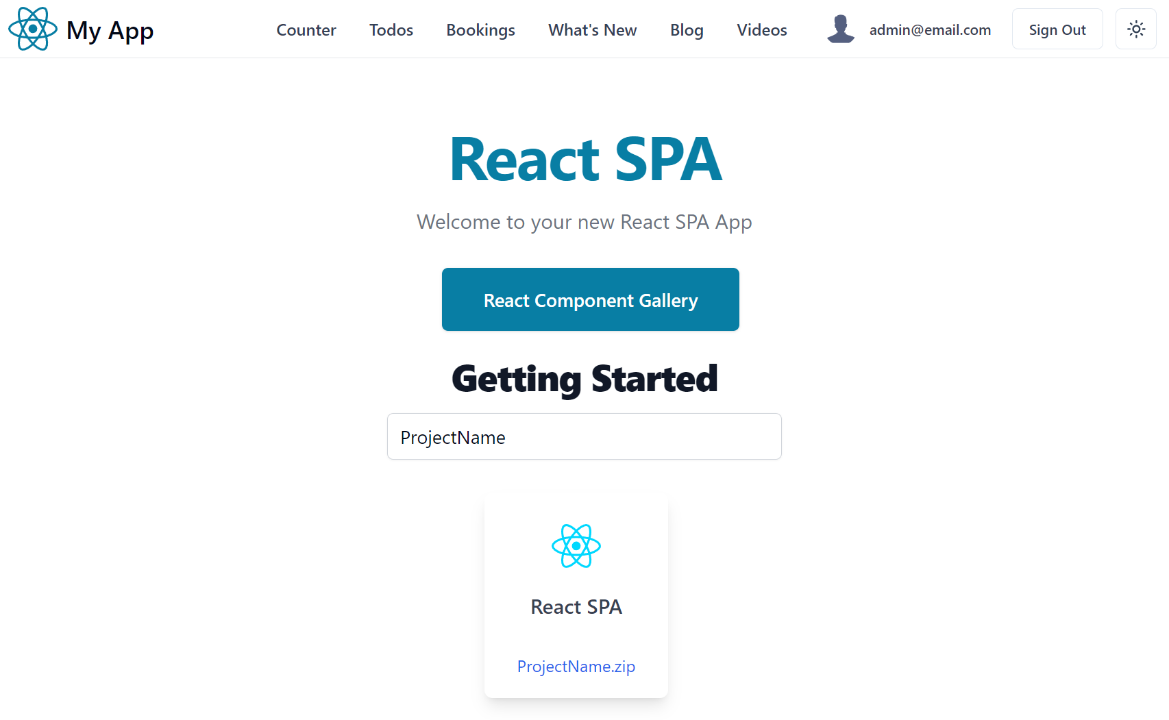
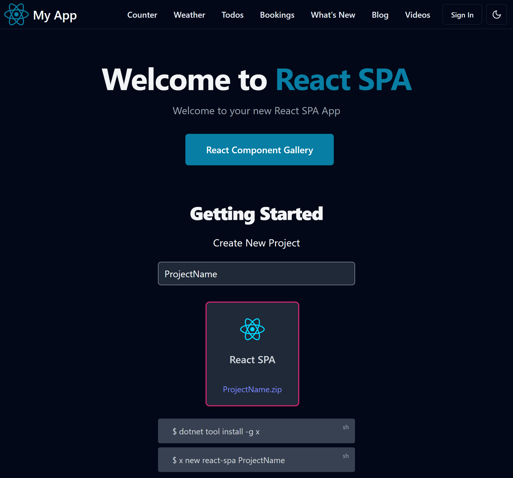
Explore the high productivity features in the new ServiceStack React SPA template
Live Demo
ASP.NET Core React SPA Template
The React and ASP.NET Core template provides a seamless starting solution which runs both the .NET API backend and Vite React frontend during development.
It's a modern template enabling an excellent developer workflow for .NET React Apps, configured with Vite's fast HMR (Hot Module Reload), TypeScript support with TSX enabling development of concise and expressive type-safe components.
Minimal API integration
Whilst a great starting point, it's still only a basic template configured with a bare-bones React Vite App that's modified to show an example of calling a Minimal API.
And the need for hand maintained Types to describe the shape of the API responses with Stringly Typed fetch API calls referencing string routes:
interface Forecast {
    date: string;
    temperatureC: number;
    temperatureF: number;
    summary: string;
}

function App() {
    const [forecasts, setForecasts] = useState<Forecast[]>();

    useEffect(() => {
        populateWeatherData();
    }, []);
    //...
}

async function populateWeatherData() {
    const response = await fetch('weatherforecast');
    const data = await response.json();
    setForecasts(data);
}
Which is used to render the API response in a hand rolled table:
function App() {
    //...
    const contents = forecasts === undefined
        ? <p><em>Loading... Please refresh once the ASP.NET backend has started. See
            <a href="https://aka.ms/jspsintegrationreact">jsps</a> for more details.
            </em></p>
        : <table className="table table-striped" aria-labelledby="tableLabel">
            <thead>
            <tr>
                <th>Date</th>
                <th>Temp. (C)</th>
                <th>Temp. (F)</th>
                <th>Summary</th>
            </tr>
            </thead>
            <tbody>
                {forecasts.map(forecast =>
                    <tr key={forecast.date}>
                        <td>{forecast.date}</td>
                        <td>{forecast.temperatureC}</td>
                        <td>{forecast.temperatureF}</td>
                        <td>{forecast.summary}</td>
                    </tr>
                )}
            </tbody>
        </table>;
}
ServiceStack API Integration
Fortunately ServiceStack can significantly improve this development experience with the /api pre-defined route where only a single proxy rule is needed to proxy all APIs:
export default defineConfig({
    //...
    server: {
        proxy: {
            '^/api': {
                target,
                secure: false
            }
        },
    }
})
End-to-end Typed APIs
Instead of hand-rolled types and Stringly Typed API calls, it utilizes server generated TypeScript DTOs with a generic JsonServiceClient to enable end-to-end Typed APIs:
import { useState, useEffect } from "react"
import { useClient } from "@/gateway"
import { GetWeatherForecast } from "@/dtos"

const client = useClient()
const [forecasts, setForecasts] = useState<Forecast[]>([])

useEffect(() => {
    (async () => {
        const api = await client.api(new GetWeatherForecast())
        if (api.succeeded) {
            setForecasts(api.response!)
        }
    })()
}, [])
This benefits in less code to maintain, immediate static typing analysis to ensure correct usage of APIs and valuable feedback when APIs are changed, that's easily updated with a single command:
npm run dtos
React Component Ecosystem
Given it's popularity, React has arguably the richest ecosystem of freely available libraries and components, a good example are the popular shadcn/ui Tailwind components. Unlike most libraries they're source copied piecemeal into your project where they're locally modifiable, i.e. instead of an immutable package reference.
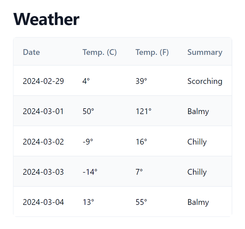
As they're just blueprints, they're not dependent on a single library and will utilize the best library to implement each component if needed. E.g. the Data Table component documents how to implement your own Data Table utilizing the headless TanStack Table - a version of which we've built into DataTable.tsx which is used in the template to implement both complex CRUD UIs and weather.tsx simple table results:
import { columnDefs, DataTable, getCoreRowModel } from "@/components/DataTable.tsx"
const columns = columnDefs(['date', 'temperatureC', 'temperatureF', 'summary'],
({ temperatureC, temperatureF}) => {
temperatureC.header = "Temp. (C)"
temperatureF.header = "Temp. (F)"
temperatureC.cell = temperatureF.cell = ({ getValue }) => <>{getValue()}°</>
})
return (<LayoutPage title="Weather">
<DataTable columns={columns} data={forecasts} getCoreRowModel={getCoreRowModel()} />
</LayoutPage>)
To render the /weather customized Data Table:
The template also includes customizable Form.tsx Input components which can be used to create beautiful validation-bound forms which effortlessly integrates with ServiceStack's Error Handling and Declarative Validation attributes.
ServiceStack React SPA Features
Other high-productivity features available in the ServiceStack React SPA template include:
Integrated Identity Auth
Pre-configured with ASP.NET Core Identity Auth, including Sign In and Custom Registration APIs and UI Pages which can be customized as needed, examples of Role-based security as well as a turn key solution for Integrating Identity Auth Registration workflow with your SMTP Provider with all emails sent from a managed non-blocking Background MQ for optimal responsiveness and execution.
tailwindcss
Tailwind has quickly become the best modern CSS framework for creating scalable, mobile-first responsive websites built upon a beautiful expert-crafted constraint-based Design System that enables effortless reuse of a growing suite of Free Community and professionally-designed Tailwind UI Component Libraries, invaluable for quickly creating beautiful websites.
In addition to revolutionizing how we style mobile-first responsive Apps, Tailwind's Dark Mode does the same for enabling Dark Mode a feature supported throughout the template and its Tailwind UI Components.
Built for Productivity
So that you're immediately productive out-of-the-box, the template includes a rich set of high-productivity features, including:
| tailwind/typography | Beautiful css typography for markdown articles & blog posts |
| tailwind/forms | Beautiful css form & input styles that's easily overridable |
| Markdown | Native mdx Markdown integration |
| React Router | Full featured routing library for React |
| plugin/press | Static markdown for creating blogs, videos and other content |
| plugin/pages | Conventional file system based routing for Vite |
| plugin/svg | Load SVG files as React components |
| Iconify | Unified registry to access 100k+ high quality SVG icons |
Bookings CRUD Pages
The Bookings CRUD example shows how you can utilize a customized Data Table and templates Form components to create a beautifully styled CRUD UI with minimal effort.
Vite Press Plugin
Most Apps typically have a mix of dynamic functionality and static content which in our experience is best maintained in Markdown, which is why excited about the new Vite Press Plugin which brings the same Markdown features in our razor-ssg, razor-press and our blazor-vue templates, and re-implements them in Vite where they can be used to add the same rich content features to Vite Vue and Vite React Apps.
A goal for vite-press-plugin is to implement a suite of universal markdown-powered features that can be reused across all our Vue, React and .NET Razor and Blazor project templates, allowing you to freely copy and incorporate same set of markdown feature folders to power markdown content features across a range of websites built with different technologies.
All of Razor SSG's features are available in Vite Press Plugin, including:
- Blog - Full Featured, beautiful Tailwind Blog with multiple discoverable views
- What's New - Build Product and Feature Release pages
- Videos - Maintain Video Libraries and Playlists
- Metadata APIs - Generate queryable static .json metadata APIs for all content
- Includes - Create and reuse Markdown fragments
It also supports an enhanced version of markdown for embedding richer UI markup in markdown content where most of VitePress Containers are supported, including:
- Custom Markdown Containers
- Alerts
infotipwarningdanger
copyshyoutube
- Alerts
- Markdown Fenced Code Blocks - Convert fenced code blocks into Richer UIs
React Components In Markdown
At the cost of reduced portability, you’re also able to embed richer Interactive Vue components directly in markdown:


