Build Beautiful Admin UIs, Fast


Built into the latest blazor-vue project template include examples of both Server
Multi Razor Page and Client rendered Admin UI Pages demonstrating how to use the new <sidebar-layout> and
<auto-query-grid> Vue Tailwind components to build beautiful Admin UI Pages in minutes.
As we use AutoQuery to develop most new APIs we often lean on Locode's instant Auto Admin UI at the start of every project to manage backend RDBMS tables freeing, us to focus most of our efforts on the user-facing features adding the most value.
This was also the case for CreatorKit where its Locode Admin UI:
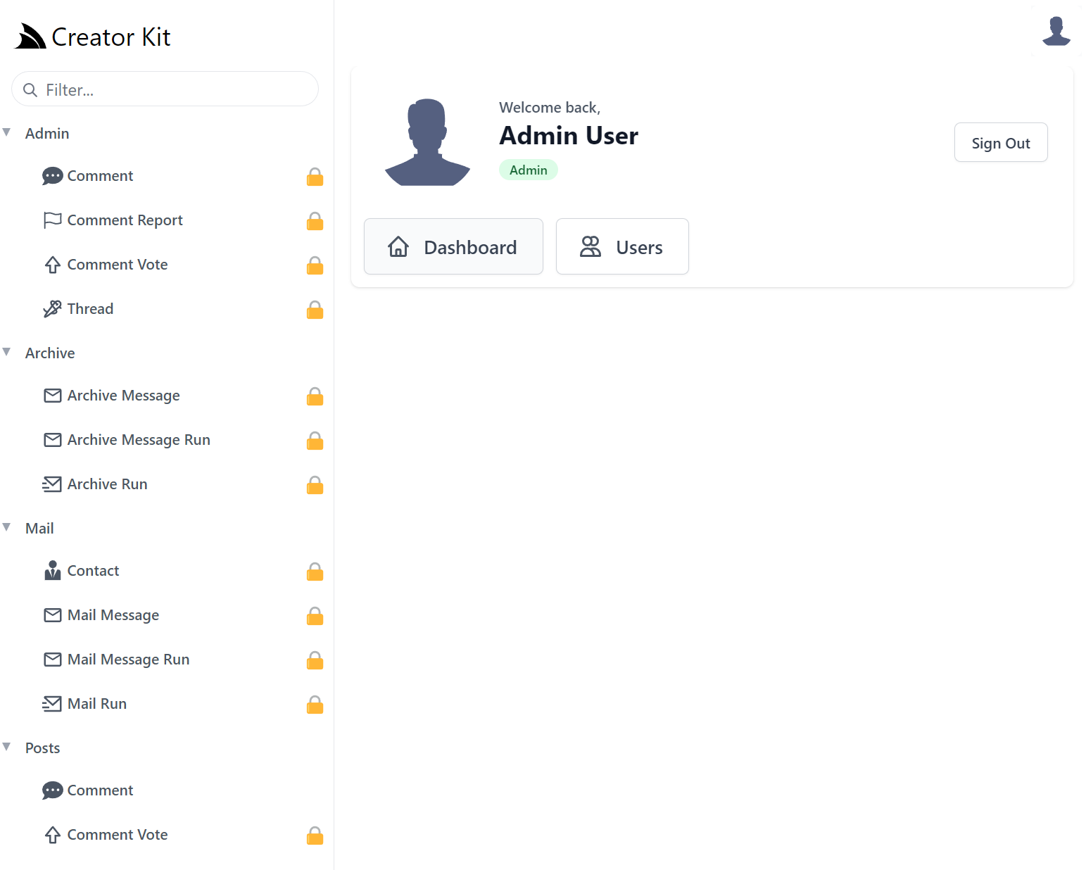
Which was sufficient enough to develop CreatorKit's embeddable Tailwind Components, however the Admin Portal itself also makes up a significant part of the user-facing value proposition in CreatorKit that we ultimately decided to develop a Custom UI for its Admin Portal in order to gain complete control of its UX and freedom to create the optimized UI we want to in future.
Adopting a Simple, Modern JavaScript approach free of build tools complexity with the instant live reload of a simple static index.html yielded the most productive workflow, combined with all built-in UIs having been rebuilt in reusable Vue 3 components meant we were able to replicate most of Locode's functionality into a customizable Vue App in no time!
SidebarLayout Vue Component
So much so that we believe this is a great progressive option for others needing to move beyond Locode or
looking to create their own customizable Admin UI. To minimize the effort we've encapsulated Tailwind's Responsive
Sidebar Navigation into a reusable
<SidebarLayout /> Vue 3 component and upgraded the Blazor Vue project template
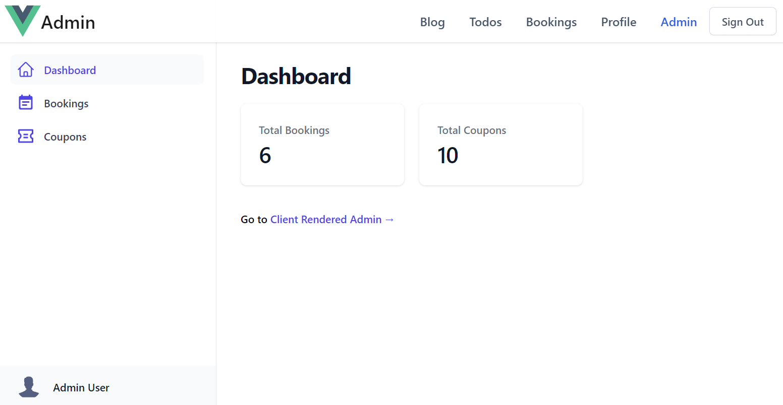
to include both a Razor Pages server rendered Admin UI:
As well as a client rendered Admin UI created from a single static index.html
We'll quickly go through how we can easily extend each layout to with new pages and AutoQueryGrid components to manage new tables.
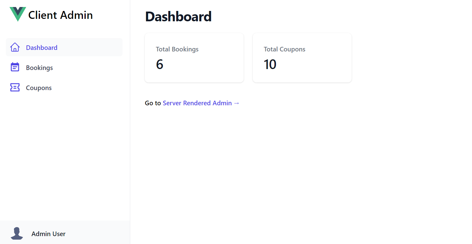
Client Admin UI
The customizable UI is maintained within a single JS Object literal that defines all the sections in the Admin UI. Each section defines the Menu Item on the Sidebar, the Title of the Page and the Vue 3 component body to display when selected:
const sections = {
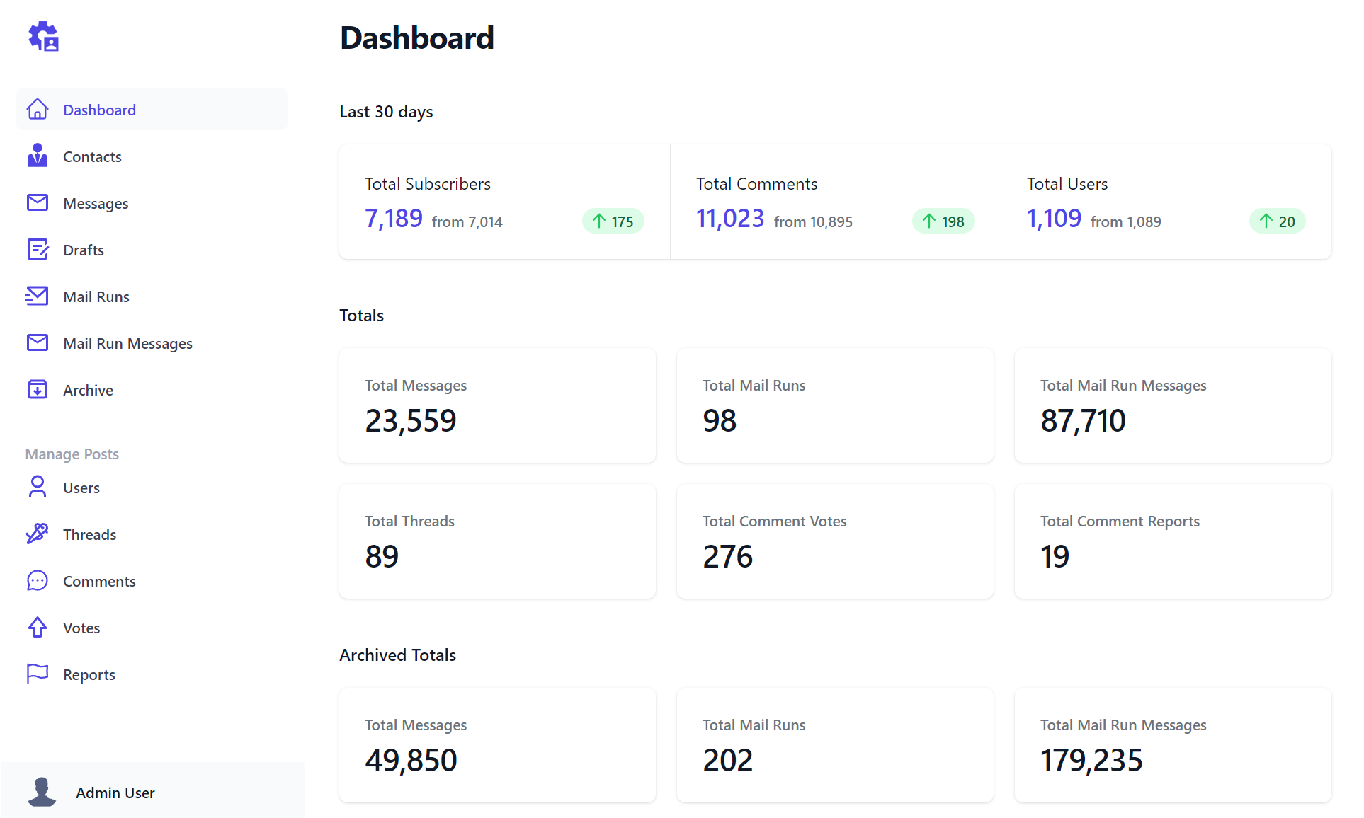
Dashboard: {
icon: `<svg fill="none">...</svg>`,
component: {
template:`
<div>
<dl class="mt-5 grid grid-cols-1 gap-5 sm:grid-cols-3">
<div v-for="stat in stats" @click="$emit('nav',stat.label)" class="...">
<dt class="...">Total {{humanize(stat.label)}}</dt>
<dd class="...">{{formatNumber(stat.total)}}</dd>
</div>
</dl>
</div>`,
setup() {
const client = useClient()
const stats = ref([])
client.swr(new AdminData(), r => stats.value = r.response?.pageStats || [])
const formatNumber = value => new Intl.NumberFormat().format(value)
return { stats, humanize, formatNumber }
}
},
},
Bookings: {
type: 'Booking',
component: {
template:`<AutoQueryGrid :type="type"
selected-columns="id,name,roomType,roomNumber,bookingStartDate,cost,couponId,discount"
:header-titles="{ roomNumber:'Room No', bookingStartDate:'Start Date', couponId:'Coupon' }"
:visible-from="{ roomNumber:'lg', cost:'md', couponId:'xl', discount:'never' }" />`,
},
},
Coupons: {
type: 'Coupon',
component: {
template:`<AutoQueryGrid :type="type" />`,
},
},
}
Each section can use optional properties to customize their appearance with the properties below:
icon- SVG Icon to use in the Sidebar Menu Itemtype- Metadata Type to use to populate icon or reference in componentlabel- The label of the menu item on the Sidebartitle- The Title of the pagegroup- The Sidebar group where the menu item should be displayed incomponent- The page's Vue 3 component body
All properties except for component are optional, defaulting to the section name and default icon when not provided.
The above example creates an Admin UI with 3 different types of pages:
- A custom component to display the Dashboard
- A customized responsive AutoQueryGrid to manage Bookings
- A default AutoQueryGrid to manage Coupons
Most of the time you'll just need to use the default AutoQueryGrid to enable a CRUD UI to manage your RDBMS tables.
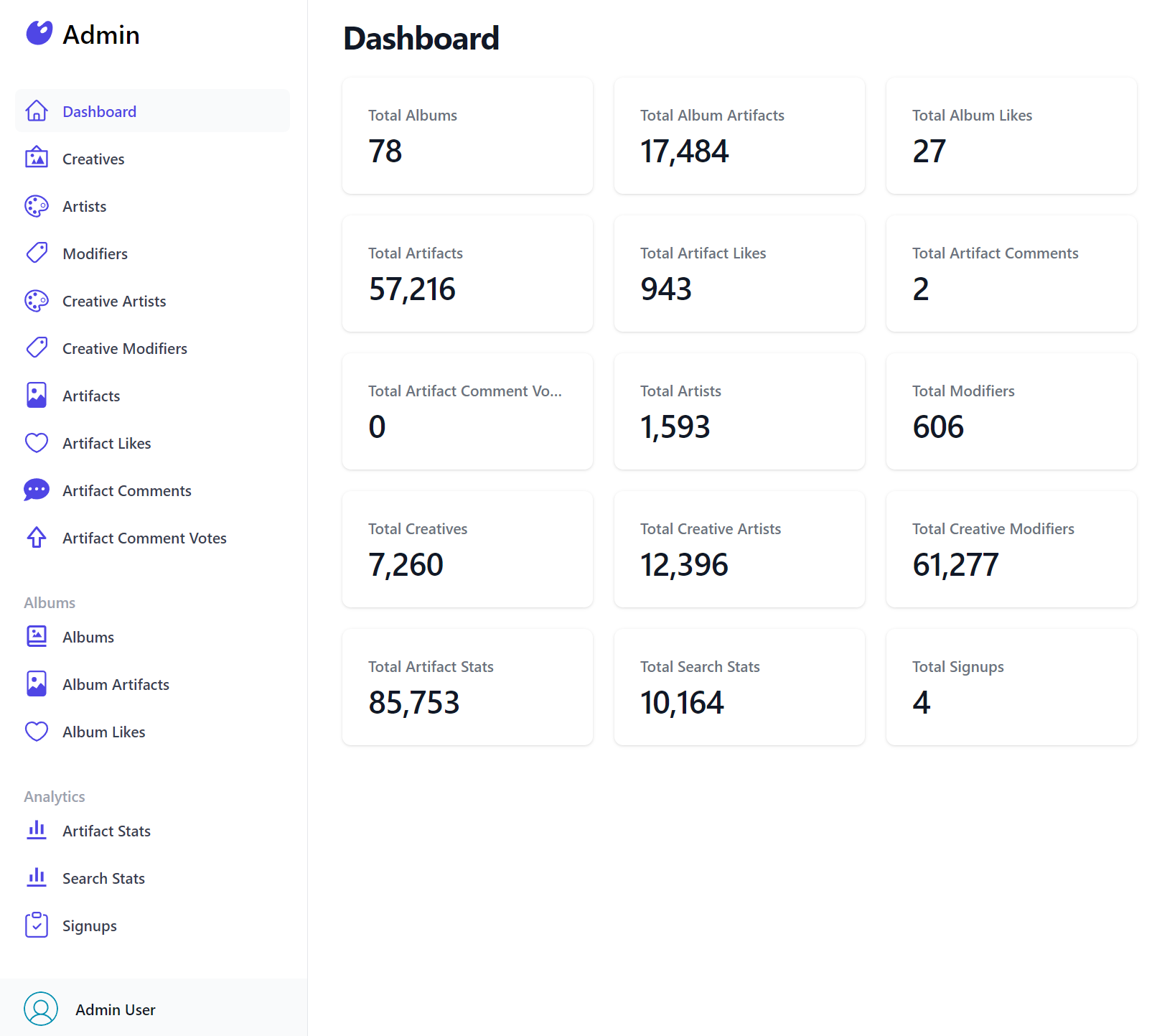
Which was all that was needed to render Blazor Diffusion's Admin UI:
const sections = {
Dashboard: {
icon: `<svg>...</svg>`,
component: {
template:`
<div>
<dl class="...">
<div v-for="stat in stats" @click="$emit('nav',stat.label)" class="...">
<dt class="...">Total {{humanize(stat.label)}}</dt>
<dd class="...">{{formatNumber(stat.total)}}</dd>
</div>
</dl>
</div>`,
setup() {
const client = useClient()
const stats = ref([])
client.swr(new AdminData(), r => stats.value = r.response?.pageStats || [])
const formatNumber = value => new Intl.NumberFormat().format(value)
return { stats, humanize, formatNumber }
}
},
},
Creatives: {
type: 'Creative',
component: { template:`<AutoQueryGrid :type="type" />` },
},
Artists: {
type: 'Artist',
component: { template:`<AutoQueryGrid :type="type" />` },
},
Modifiers: {
type: 'Modifier',
component: { template:`<AutoQueryGrid :type="type" />` },
},
CreativeArtists: {
type: 'CreativeArtist',
component: { template:`<AutoQueryGrid :type="type" />` },
},
CreativeModifiers: {
type: 'CreativeModifier',
component: { template:`<AutoQueryGrid :type="type" />` },
},
Artifacts: {
type: 'Artifact',
component: { template:`<AutoQueryGrid :type="type" />` },
},
ArtifactLikes: {
type: 'ArtifactLike',
component: { template:`<AutoQueryGrid :type="type" />` },
},
ArtifactComments: {
type: 'ArtifactComment',
component: { template:`<AutoQueryGrid :type="type" />` },
},
ArtifactCommentVotes: {
type: 'ArtifactCommentVote',
component: { template:`<AutoQueryGrid :type="type" />` },
},
Albums: {
group: 'Albums',
type: 'Album',
component: { template:`<AutoQueryGrid :type="type" />` },
},
AlbumArtifacts: {
group: 'Albums',
type: 'AlbumArtifact',
component: { template:`<AutoQueryGrid :type="type" />` },
},
AlbumLikes: {
group: 'Albums',
type: 'AlbumLike',
component: { template:`<AutoQueryGrid :type="type" />` },
},
ArtifactStats: {
group: 'Analytics',
type: 'ArtifactStat',
component: { template:`<AutoQueryGrid :type="type" />` },
},
SearchStats: {
group: 'Analytics',
type: 'SearchStat',
component: { template:`<AutoQueryGrid :type="type" />` },
},
Signups: {
group: 'Analytics',
type: 'Signup',
component: { template:`<AutoQueryGrid :type="type" />` },
},
}
Server Admin UI
For developers preferring to develop Server rendered Web Apps the blazor project template also includes a Multi Page App (MPA) Razor Pages & Vue App which defines the Admin Sections in the custom C# Admin/
<NavList Title="Admin">
    <NavListItem Title="Bookings" href="/admin/bookings" Icon=@typeof(Booking).GetIcon()>
        Create and Manage Bookings
    </NavListItem>
    <NavListItem Title="Coupons" href="/admin/coupons" Icon=@typeof(Coupon).GetIcon()>
        Create and Manage Coupons
    </NavListItem>
</NavList>
Where each section links to the different Admin UI Razor Pages:
Admin/Index.razor
Generates the Admin UI Dashboard which retrieves the data for the page from the AdminData API invoked
with the internal Service Gateway:
@page
@{
    ViewData["Title"] = "Dashboard";
    var adminData = await Html.Gateway().SendAsync(new AdminData());
}

<div>
    <dl class="mt-5 grid grid-cols-1 gap-5 sm:grid-cols-3">
        @foreach (var item in adminData.PageStats)
        {
            <a href="/admin/@item.Label.ToLower()" class="...">
                <dt class="...">Total @item.Label</dt>
                <dd class="...">@item.Total</dd>
            </a>
        }
    </dl>
</div>
Admin/Bookings.razor
Defines the same responsive AutoQueryGrid to manage the Bookings RDBMS Table:
<AutoQueryGrid Model="Booking" Apis="Apis.AutoQuery<QueryBookings,CreateBooking,UpdateBooking,DeleteBooking>()" />
Admin/Coupons.razor
Utilizes the default AutoQueryGrid component to manage the Coupons RDBMS Table:
<AutoQueryGrid Model="Coupon" Apis="Apis.AutoQuery<QueryCoupons>()" />
Creating Custom Admin UIs
Easiest way to start creating Custom Admin UIs is to start with a new blazor-vue Razor Pages template containing both client and server rendered Admin UIs:
Alternatively you can download their pages to incorporate them into your existing Tailwind Projects:
Client Admin UI
Server Admin UI
Conclusion
In summary, the <SidebarLayout> and <AutoQueryGrid>
Tailwind Vue Components are valuable tools for
software developers seeking to expedite creation of efficient and user-friendly Admin UIs by
providing a solid foundation to effortlessly build beautiful, customizable Admin Pages in no time, freeing up
valuable time & developer resources to focus the majority of efforts into creating the user-facing features that matter most.


